Selected work

Two sites. Both had the same problem: nobody was doing anything.

A visitor landed, read, and left. Here's what was actually broken and what I changed — no awards, no invented percentages.

DM “SITE” for a free audit
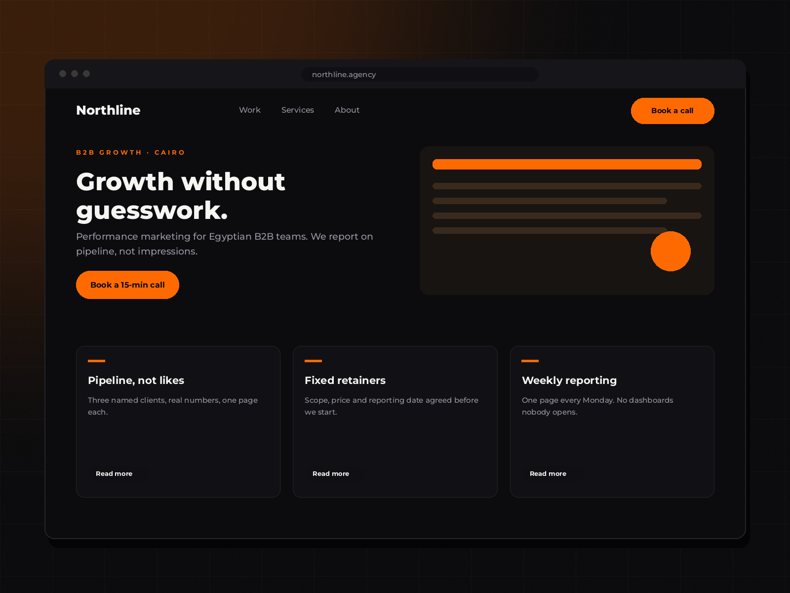
Marketing agency homepage mockup: dark hero with the headline 'Growth without guesswork', orange primary button, and three case study cards beneath.

01 · Marketing agency · Cairo

An agency site that has to earn the meeting.

WordPress Lead generation Copy structure

Timeline

6 days, one revision round

The one action

Book a 15-minute call

Layout preview. Real screenshots and measured results go here as each build ships.

What was wrong

A nine-page brochure with three competing calls to action on the homepage and a contact form that emailed an address nobody checked. Their best proof — two named results with real numbers — was buried on page six.

What I changed

  • Four pages instead of nine. Every page asks for the call, once.
  • Proof moved above the fold: one client, one number, one sentence.
  • Enquiries land in email and WhatsApp, with a reply-time promise on the button.
  • Services rewritten as outcomes the client can price, not a list of disciplines.
  • Under 2s load on mobile, since their buyers open links from WhatsApp.

Watch this space

Baseline captured on launch day. I publish the 30-day enquiry numbers here — good or bad.
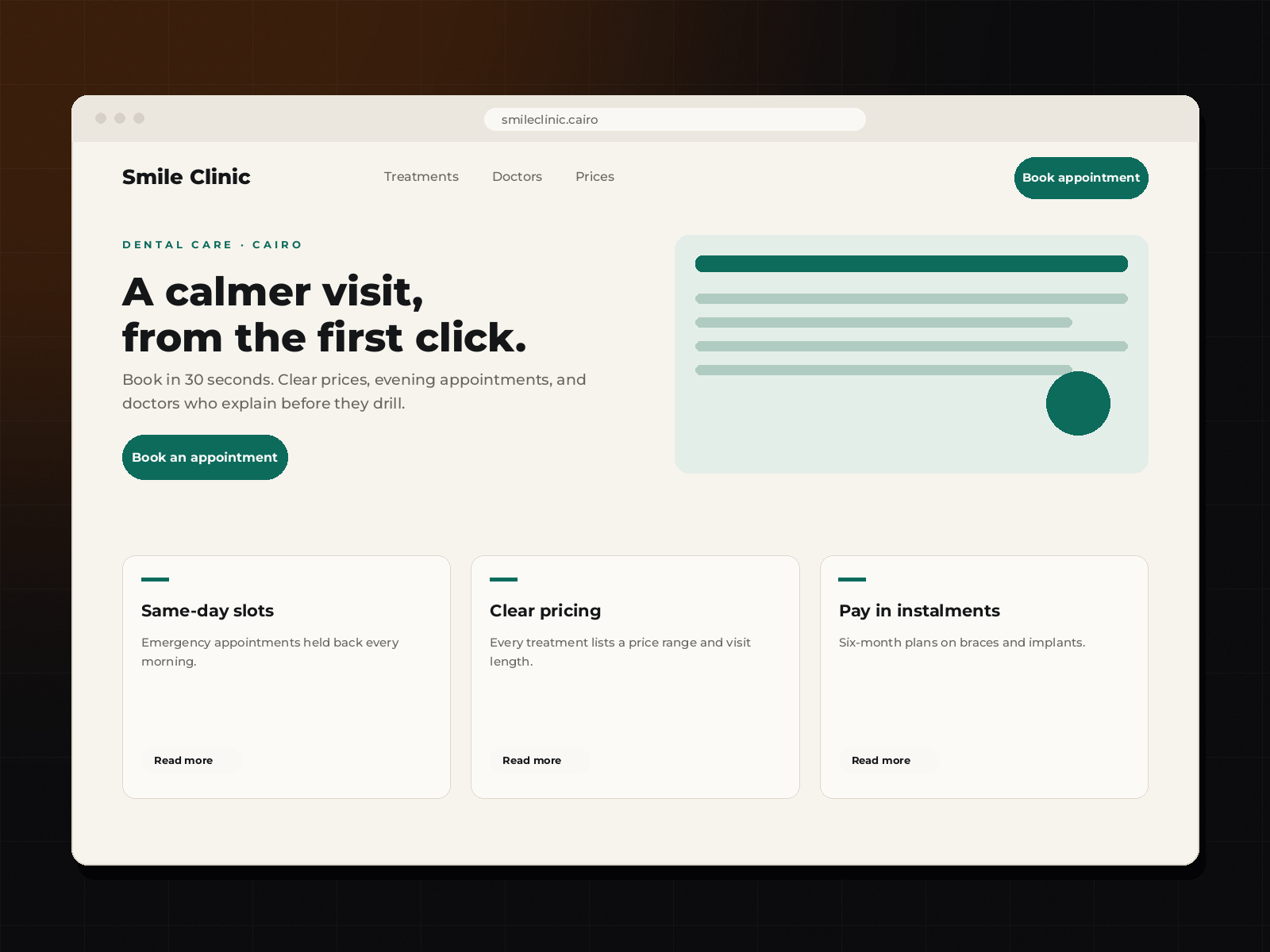
Dental clinic homepage mockup: appointment booking bar at the top, a bright hero reading 'A calmer visit, from the first click', treatment cards and a WhatsApp booking button.

02 · Dental clinic · Cairo

A clinic that lives or dies on the booking button.

WordPress Booking flow Arabic + English

Timeline

8 days, two revision rounds

The one action

Book an appointment

Layout preview. Real screenshots and measured results go here as each build ships.

What was wrong

The phone number was an image, the booking link was on the contact page, and the treatments were described in language patients don't use. Most visitors were on a phone, at night, deciding whether to call tomorrow.

What I changed

  • Booking bar pinned to the top and a sticky mobile button — always one tap away.
  • Tap-to-call and WhatsApp as equal options, because half the patients won't fill a form.
  • Treatments explained in plain language with price ranges and visit length.
  • Doctor credentials and clinic photos near the top: trust before treatment.
  • Directions, parking and opening hours in the footer of every page.

Watch this space

Baseline captured on launch day. The 30-day booking numbers get published here too.

The pattern

Different industries, identical diagnosis.

Neither business needed a redesign. They needed a decision: what is this page asking the visitor to do? Once that's answered, the design writes itself and the price becomes easy to justify.

  • One action per page

    If everything is a call to action, nothing is. Every extra button splits attention.

  • Proof before promise

    One named result beats a wall of adjectives. If there's no result yet, show the work itself.

  • The phone is the website

    Built and tested on a mid-range Android on 4G. That's where the customer actually is.

Your turn

Let's find the leak in your site.

Free, 15 minutes, three specific fixes. Even if you never hire me, you'll leave with a to-do list.

DM “SITE” for a free audit